Color Theory
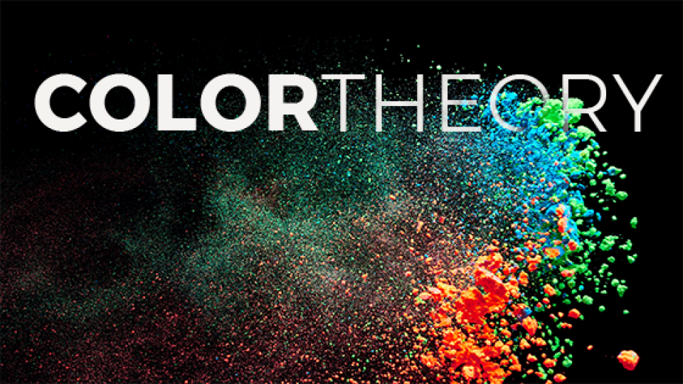
Color Theory
Just looking at a brand’s color scheme can give you an idea of the brand’s values. We all associate colors with meanings and emotions, and colors do a lot of heavy lifting in any design. A poorly chosen color scheme can leave a brand floundering.
Color meanings can be learned from society (black is funereal), or they can be intuitive (green represents nature). Many colors have a different significance in different cultures. Ultimately, color meaning is subjective – it’s about how you feel after all!
Red
Passionate, aggressive, bold, and exciting, red is a strong color favored by brands looking to make a statement. The color can symbolize love, medicine, and, in some cultures, good luck.
Orange
Energetic, playful, young, and fresh, orange is a great color for brands looking to stand out while still being friendly. Orange can represent oranges themselves. Orange is a color commonly used on safety gear and signs, since few colors are more striking than neon orange.
Yellow
Accessible and friendly, yellow radiates cheerful energy. Sunshine and nature are some of what it brings to mind. Because yellow is pale and low contrast compared to the rest of the rainbow, it can be hard to use it to anchor a brand. Put to use with careful design however, yellow is an eye-catching branding choice.
Green
Healthy, fresh, and tenacious, green is a great building block for a brand. Green can symbolize nature, growth or finance. Green is a color that shifts meaning significantly from dark to light – bright green and forest green have almost opposite moods.
Blue
Calm, trustworthy, mature, and classic, blue appears in more than half of all logos. A very versatile color, wildly different brands can succeed using blue. Blue brings to mind water and the sky. Blue can be welcoming and friendly without sacrificing seriousness and sophistication.
Purple
Luxurious, wise, and dramatic, purple is a color with an edge. Traditionally associated with royalty because of the prohibitive cost of purple dye in the ancient world, purple has a complex set of associations. It can be aloof and sophisticated, or aggressive and feminine.
Pink
Friendly, aggressive, and joyful, pink inherits the passionate directness of red. It offers a feminine, modern, and youthful presence.
Brown
Rugged, serious, and earthy, brown is an underutilized color that will help your brand stand out.
Black
Clean, sleek, modern, and luxurious, black is the new black! Choosing black as a main color for your brand is a bold, contemporary choice.
White
Safe, welcoming, and open, white, the absence of color, shouldn’t be discounted. Using white fills in your logo can keep darker colors from feeling too heavy, and approaching white space like a design element is always a good idea.
Gray
Not dark, not light, gray is the middle ground of mature, classic, and serious. Gray can sometimes represent modernity or technology.
This doesn’t even touch how the meaning of a hue intersects with its value and saturation – navy (dark in value) and baby blue (light in value) have very different meanings. Still, while not a complete list, this is a great guide for getting started choosing colors for your brand. You can apply it in lots of other contexts too – interior design, fashion, photography, any field where you might need to choose colors.
Colors in Context
Don’t be surprised if color meanings contradict each other! They can also change over time – the color millennial pink has garnered new significance in the past few years.
The nature of human perception also means that we really do see colors differently depending on where they are. Specifically, what other colors they’re next to. This is a visual reality as well; we really do see something different when you put two colors next to each other than we do with an individual color alone. Many optical illusions take advantage of this – we all remember “the dress”.
But colors and their context also affect how we perceive their emotional meaning. For example, yellow by itself is cheerful, but yellow on a black background is much more serious (it brings to mind construction work, or bees). Similarly, red and blue separately have very different meanings than red and blue together – in America those colors are loaded with symbolism! And they’re high contrast, which has it’s own mood.
So choosing a brand’s colors is a bit like cooking: the ingredients all have their own tastes when they’re alone, but when you put them together those flavors react with each other in complex ways to become something totally new.