3 Things Turkeys Can Teach You About Your Logo
3 Things Turkeys Can Teach You About Your Logo
It's All About What You Bring To The Table
Your logo is a huge part of your brand. It's what people use to identify every essential and non-essential aspect of your business. If you plan on being in business 50 years from now, have you thought about how your logo is going to look carved into an ice sculpture at your anniversary celebration? What, am I thinking too far ahead? Okay, what about the sticker you'll be using to seal those holiday cards this year? Will people get excited about the content inside once they see your logo, or will they think "Ugh, I guessss I have time to waste reading this"?
If you aren't sure, then consider this: Benjamin Franklin wanted to put a turkey on our National Seal. Yep, when the National Seal was being created in 1776 and the bird that was going to be depicted on it was up for debate, Benny felt that the turkey was "... though a little vain & silly, a Bird of Courage, and would not hesitate to attack a Grenadier of the British Guards". Clearly the other committee members could not foresee a turkey representing our nation, and thus the Bald Eagle became the bird embellished on the National Seal.
In the spirit of Thanksgiving, we'd like to officially thank whoever it was that chose not to let Ben Franklin put a turkey in America's logo. Bless you. More importantly, we can't help but wonder: Is that the real reason the turkey gets a presidential pardon each Thanksgiving? Too much guilt over the snub, maybe? Mind = Blown.
Going off of that, here are 3 Things Turkeys Can Teach You About Your Logo.
1. Go For The Premium Bird
How it applies: Quality trumps quantity
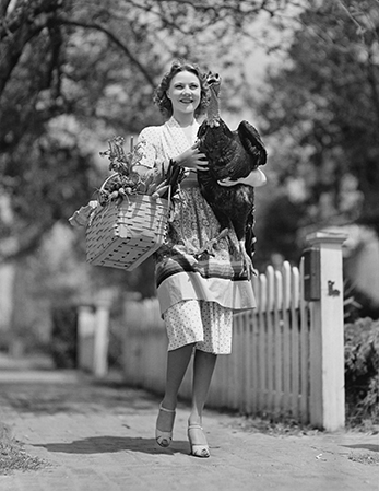
"#leftoversfordays"
Just like your ambrosia salad is meant to show to guests how much better thankful you are, your logo is supposed to communicate who you are, what you offer, why you do what you do, and what makes you so darn special (besides that delicious ambrosia salad). It also has to be relevant for the business it identifies. Accomplishing this can be a tall order to fill, especially if short-term savings is the primary goal.
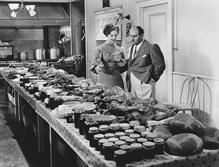
Successful design relies on a great deal of thought, consideration and in-depth research into the industry involved. From your font choice to your color palette, each element of a logo's design should be made with the consumer in mind. It takes time and - if you want it done the right way - a bit more money, but the extra effort will be worth it when the end result is a perfectly seasoned logo that keeps your customers coming back for more.
2. Don't Overdo It On The Side Dishes
How it applies: Keep it simple & memorable
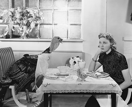
"Ease up on the gravy, Janet. Let the bird speak for itself, that thing is premium!"

We rely on branding - specifically logos - to establish a presence in the consumer's mind and attract and keep customers. In order to be effective at this, your logo should be recognizable and worth remembering.
Distinguishing characteristics are key here. Why? Because people can't remember it unless they can describe it. Some of the top brands in the world have logos that are just as recognizable without names as they are with them. For instance, consider which brand name comes to mind when I describe -
- - an apple with a bite taken out of it
- - two golden arches
- - a black checkmark, slanted
- - a red bullseye
If you answered: Apple, Mcdonald's, Nike, Target, it's likely because these logos have become synonymous with their brands. How? The same way elementary schoolers are given handprint cutouts to learn what a turkey is. Long-term recognition relies on something being simple enough to understand and significant enough to remember. That's not to say that every great logo comes from Kindergarten flashcards. The goal, however, is to generate a thought, not a thesis.
3. Make It Delicious
How it applies: You've got to love it
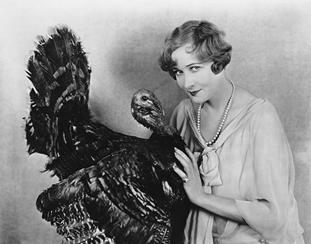
It's important to choose a logo that you're proud of. After all, it's going to be with you for a long time. Plus, a bad logo can distort your business image and cause all of your branding efforts to backfire. With the right marketing strategy, every social network, t-shirt, mug, billboard, web page, and ballpoint pen will carry your logo, so choose one you're going to enjoy talking about.
Contact Us
Not only are we Thanksgiving meal connoisseurs, we're also branding experts. Let us put what we know to work for you. Get started by filling out our project planner. Oh, and HAPPY THANKSGIVING!
